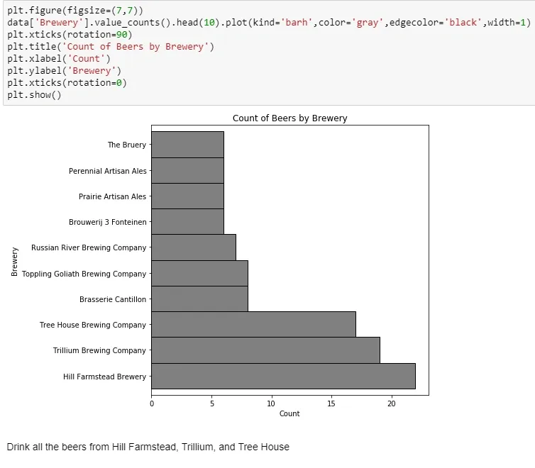
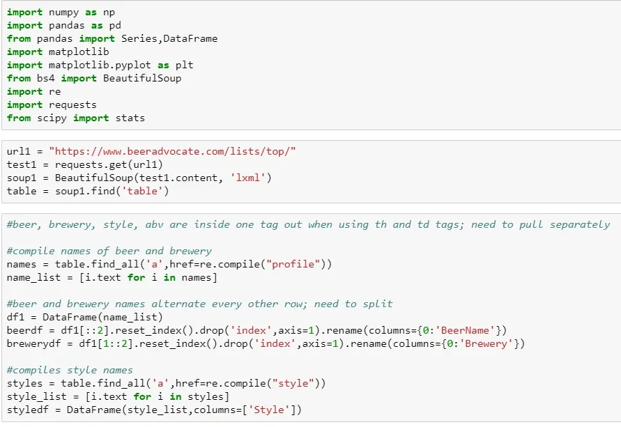
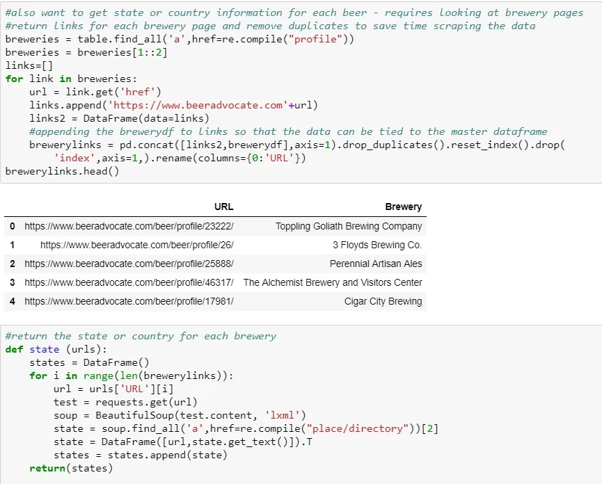
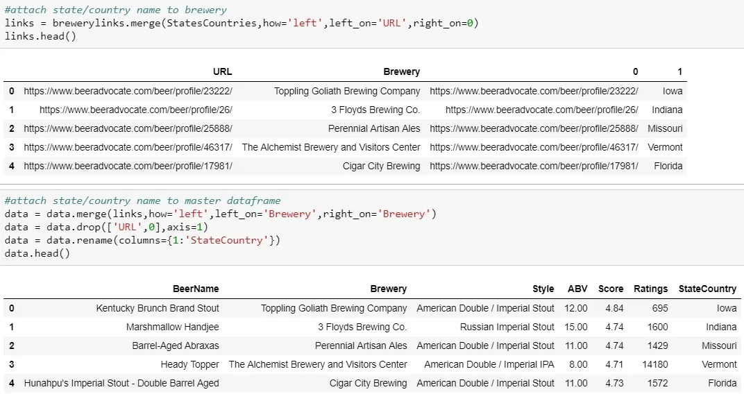
Now that the fall quarter is over and I have some free time, I’ve decided to dive in on some data from boardgamegeek.com. Board Game Geek is a site for all things board games (shock!) and is generally regarded as a great resource for reviews and rankings of games. I found a dataset from kaggle.com, which is basically an export of all games and data associated with them.
Board games are fun, but they are also a $10 billion industry. There is a large market here for future game design and sales, which makes it an interesting dataset to examine.
Initially, this dataset covered 90k games. But I want to look at games with significant volume, so I excluded anything with under 200 user ratings. This was a massive portion of the titles and I was left with 6.1k games. After removing games released prior to 1970 (including backgammon and marbles, both “released” in 3000 BC), games that are actually expansions or other versions of another game, and card games I was down to about 3.1k titles.
There are two main variables of interest throughout that measure “quality”: Average Score and Number of Ratings. Ratings are highly skewed, with a few games getting a ton of users rating them, but the vast majority are down under 1000 or so. Input variables will be mentioned throughout the models, so I won’t bore you by talking about all of them here.
Association Rules
My first models will be association rules - think of this as Amazon’s “frequently bought together” recommendations. They are “if…then…” type statements, where the “if” is known as the antecedent and the “then” is the consequent. Lift indicates how much more likely the consequent is to happen, given the antecedent.
The easiest way to understand is by example: If a game is high weight (difficulty level) and recommended for one player (antecedents), then it is 2.28 times more likely (lift) to have a score of at least 7 (consequent)
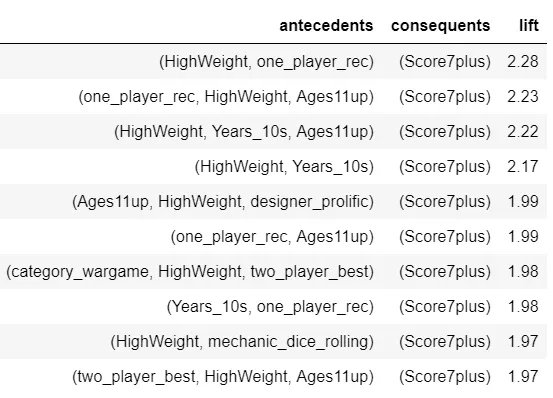
From these top rules with a consequent of Score7plus, it looks like high difficulty, newer, older ages, and recommendations for single players are indicators of higher scores.
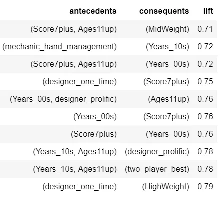
The list above was filtered just to look at Score7plus with high lift, but it could also be useful to look at rules with the lowest lift. In the example of the second rule, games with a hand management mechanic (this includes games like Catan and Ticket to Ride) are less likely (lift below 1) to have been released in the 2010s. This could point to a shift in game design in recent years.
Two other rules that look interesting are that one time designers are less likely to have their game score above 7 and are less likely to create high difficulty games. This could just be a matter of perception, but it does suggest an uphill battle for first time designers.
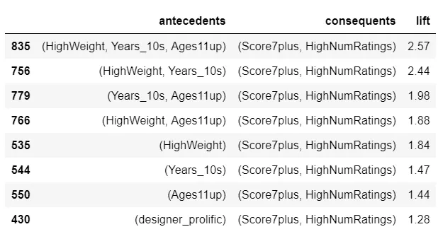
Finally, let’s look at rules with high lift and both Score7plus and HighNumRatings as consequents. Games that are newer, for an older audience, and complex (in some combination) are more likely to have a high score from a lot of ratings.
So great, I ran some algorithm and it told me a few things about the data. Now what? For this dataset, not a ton. This isn’t customer level data. I can’t tell a game store which games to put next to each other or tell Amazon which to recommend once you’ve bought Ticket to Ride.
However, it does give a better sense of what characteristics drive ratings volume and ratings score, which will help when getting on to the prediction phase.
If I were talking to a game designer and had done no other work, I’d tell them that if they want a hugely popular and well regarded game to create something that is complex and for an older crowd.
The limitations are important here though - this is about probabilities; not every new game with a minimum player age above 11 and high weight will be a winner. These rules are helpful in understanding relationships between variables, but it’s the predictive models that will be the real drivers of decision making.
Stay tuned next week for some more data!
]]>