As I’ve continued to learn about Python, I’ve been really interested in expanding the scope of what I do beyond just traditional data analysis. One thing that interested me was what I could do with images. After a lot of searching around I found some really helpful blog resources. That last link is where I grabbed the base underlying code for my next project.
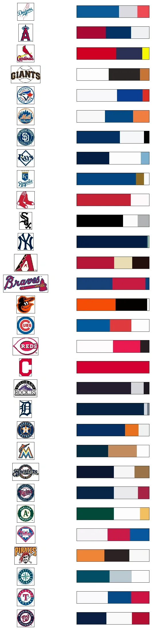
Here is the final result upfront. I took a logo for each MLB team and clustered them into 3 colors. Can you guess which is which? The answers are at the bottom of the post
I used a method called K-means clustering. Essentially what this does is loop through the pixels of the image (or data points in any kind of data set - this is definitely not an image-only methodology) and groups them into n-groups based on their similarity to each other.
The heavy lifting of the first two functions was done for me:
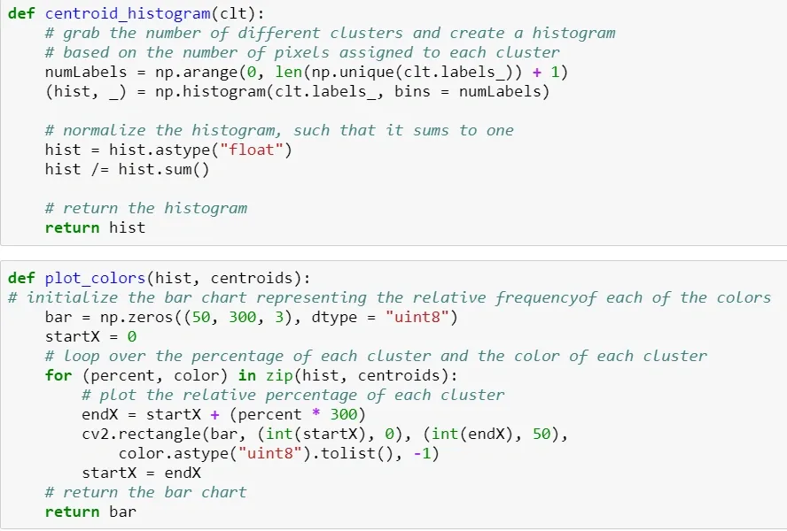
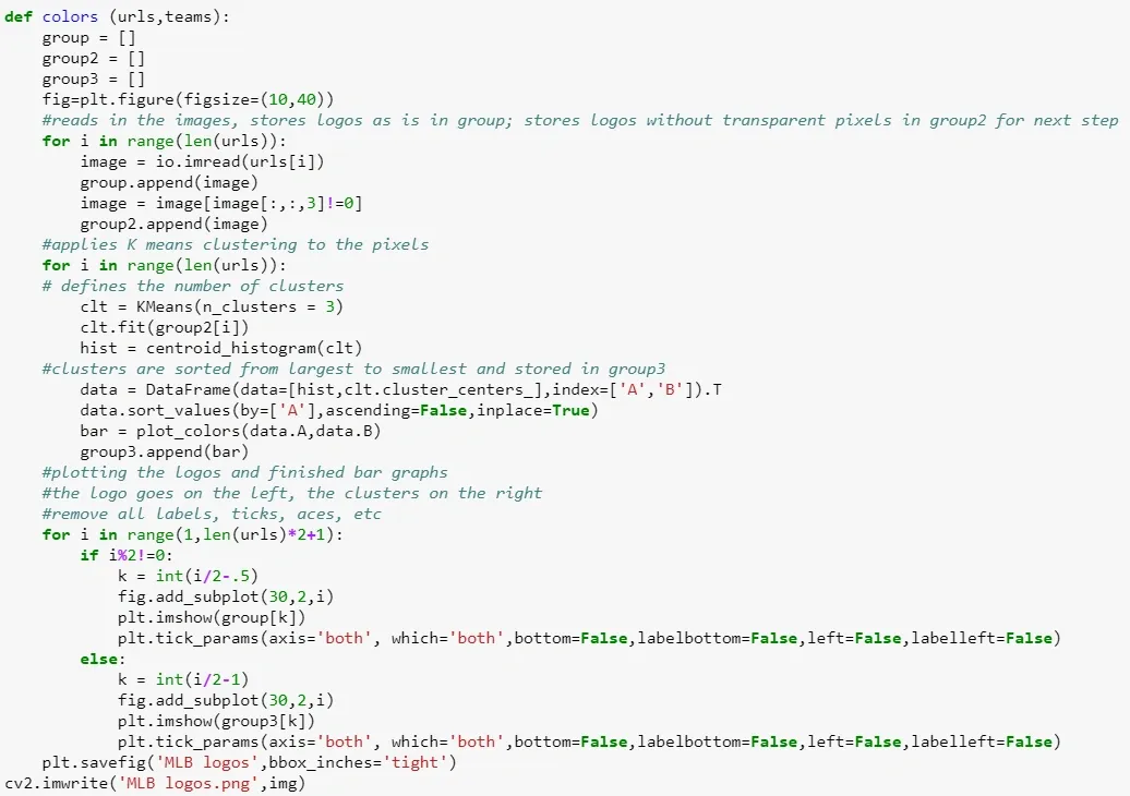
Now I just needed to make things look pretty. I wrote a function that took an original logo in RGBA format so that I could strip out the transparent background. This prevented extra white pixels from appearing - I just want to see what the logos colors look like. From there this logo is converted back to RGB and run through the clustering function. Lastly, I displayed the original logos and the new clusters side by side, to make sure that nothing weird had happened and to see which images appeared to have more clusters.
The downside to my setup is that each image has the same number of clusters. If you look at the Marlins and Pirates logos below, you’ll see that their clusters clearly don’t line up to their logos - they have more than 3 (and in the Marlins case at least 5) colors that really define their logos. My next steps would be to create the option to have different clusters for different images.
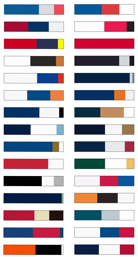
How’d you do?